
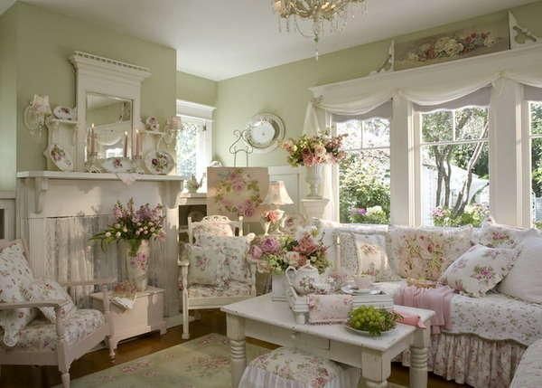
Pastel shades like pink, yellow, blue and green are the first signs of spring after a long, harsh and cold winter. The best way to make your home spring ready would be to invite these colors inside. However, many have the feeling that using pastel inside the house can make the latter look too sweet and somewhat childish. Not necessarily though! Here are some essential tips that can help you rock the pastel look in your home this spring.
Stay away from anything that has ‘baby’ attached to it
As much as you would be tempted to choose the color that says ‘baby pink’, you would risk the chance of ending up with a room that looks like bright cotton candy. Any other paint that comes with the word ‘baby’ attached to it would be alarmingly bright as well. So stay away from them at all costs.
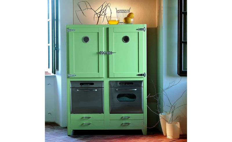
If you still prefer these colors, opt for slight variations of the same, including shades mixed with a little gray to look less saturated. These shades will look awesome on the walls while not necessarily making them look girly or childish.
Don’t go by the trends you see in a book
Home décor magazines usually display pictures of homes and interior décor, including wall colors. While these pictures are used solely to highlight the designer’s talent, they would do little justice to your home.
Emulating these trends to the ‘T’ can sometimes lead to disaster as you end up with a look that is more museum like and not homely enough to be lived in. So leave the colors on the book alone and trust your own instinct to decide which pastel color would work best for your home.
Consider the natural light entering the room
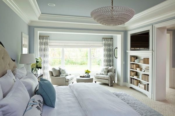
One of the greatest mistakes home owners commit when choosing pastel shades for their home is neglecting the amount of sunlight each room receives. Natural light can change the way a specific color looks on the walls, making it look much brighter than it actually is. To an extent, this will depend on the color of the sunlight that filters in from different directions as well (red from the west during sunset, blue from the east during the day and yellow from the south).
Avoid this scenario by choosing colors that do not correspond to light and the direction it is coming from. So while pinks need to stay away from west facing doors, blues and yellows need to stay away from the east and south facing doors respectively.
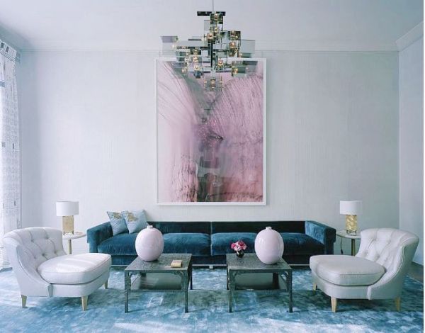
Don’t mix and match too much
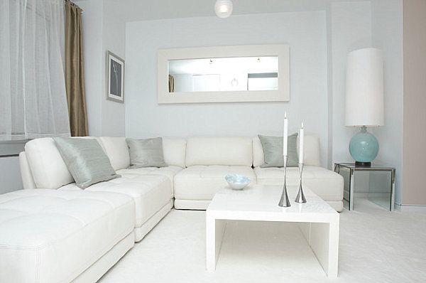
When it comes to pastel shades, the lesser the better. Adding too many pastel shades in the same room would make the latter look like a garden filled with Easter eggs. So stick to one basic pastel shade and complement it with one other shade at the max. If painting them on walls is not an option, consider using them on accent pieces scattered across the room. This will help distribute the color evenly across the room.
Don’t forget to add some edge
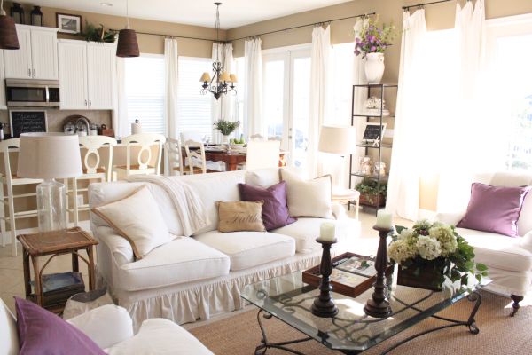
As mentioned before, pastel shades can make a room look soft and girlish. This tends to be the case no matter which shade of the color you choose. As such, the best way to use pastel shades in the room and still achieve a mature look would be to add some edgy home décor elements.
While wooden furniture will work well with pastel shades, modern furnishings and street art can be used as interior decorations. This will create the perfect balance between softness and masculinity to achieve a fresh, urban look for the room.
Spring is the perfect time to bring in those pastel shades. Follow these simple décor tips to enhance your home’s look with these beautiful colors.