
The pragmatic and orthodox home decorators believe that mixing patterns is a huge mistake that can totally ruin the appearance of your home. Modern homeowners and interior designers both believe in using different patterns and textures for enhancing the décor of a certain living space. However, you should use prints and patterns carefully to avoid a visual chaos that can confuse the mind.Smart homeowners use patterns and prints for accentuating the beauty of a room without cluttering or confusing our sight. To make the most of different patterns and prints you should learn some clever tricks seldom shared by interior designers. In the following, you will find some useful tips on combining different patterns.
Choose the family of colors you adore:
There are distinctive color palettes, which consist of colors of varying shades. You have to determine the color palette that you are most comfortable with before picking the right patterns and prints for your home. If you pick a color family just for the sake of fashion then you will regret in the long run. Some colors are considered to be cold, while others exude warmth. Pick two basic colors and a few different shades that can enhance the beauty of the base color.
It’s all about juxtaposition:
Homeowners looking to use different patterns in the same living space should be ready to experiment. Juxtaposing different patterns of same color palette is an easy trick for creating interesting interiors. Elaborate patterns with intricate designs work well with stripes. The two patterns do not collide or create visual confusion. However, make sure that the patterns are of same color family.
Keep it simple and colorful:
Bright and vibrant prints look great against the backdrop of white walls and sofas. There are many different and interesting ways of incorporating prints in a white room. The prints should be present for breaking the monotony but should not overwhelm. Use geometric pattern on cushion covers and similar design on the coffee table centerpiece. The zebra print works well and so does soft floral prints.
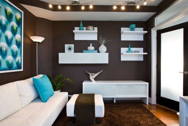
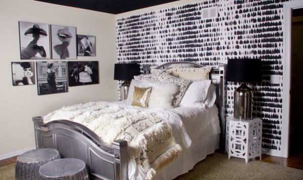
A neutral canvas can hold more patterns:
Over-the-top use of patterns can make your home look congested. Therefore, you have to use patterns in rooms painted in neutral colored rooms. Soft browns, hay, tan and gray are some good neutral options for your home. You can use bold animal prints and geomantic prints together inside a neutral shaded room. Get area carpets, pillows and upholstery of the sitting area in bold patterns.
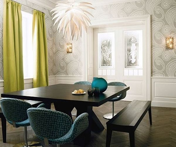
Floral on the walls:
There is nothing wrong in painting the wall in floral design. You may also use floral wallpaper on one wall but balance the vividness by using other simple patterns. White furniture like sofa set, carpet and coffee table are perfect for a floral walled room. Use cushion covers with the Gingham print and trellis design.
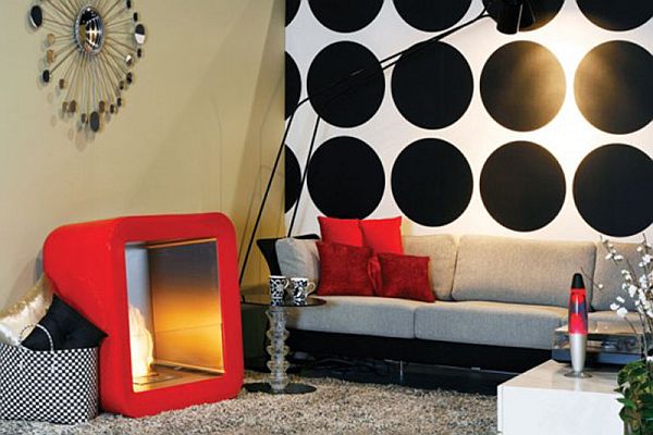
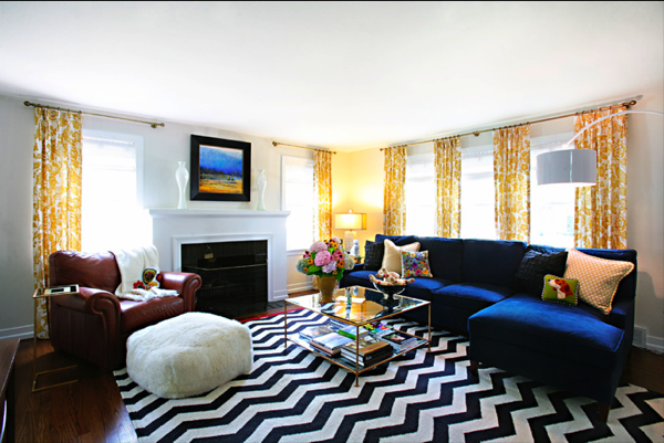
Polka dots are classic:
Wide geometric prints on the floor and intricate floral motif on the upholstery of the sofa or the window seats are a great way of combining patterns. Make sure to use shades of the same color for the different patterns. Use polka dotted stools to break the monotony and create excitement.
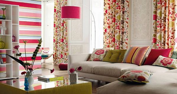
Creative chaos is good:
If you are fond of different prints like ikat, paisley and polka dots then do not shy away from using them together. Using contrasting prints together against a solid, dark colored wall works well in a spacious room. Get the upholstery done in bold ikat print and buy curtains in a different type of ikat print. Create more chaos of colors and prints with paisley printed cushion covers.
Summary:
Using prints and patterns together is a great way of elevating your house décor. Creatively mix and match contrasting patterns for making your room look lovelier.