
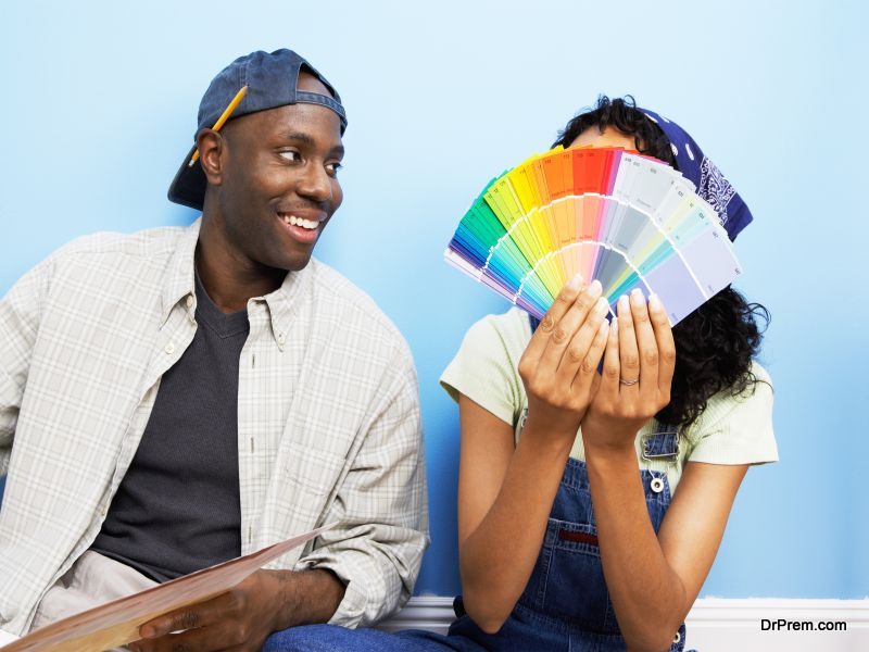
Spring is the time when most owners tend to repaint their homes. While doing so, they tend to look out for the most happening trends in paint colors and patterns, including the current flavors of that season. Well spring is right around the corner and the time has come again to consider repainting your home. If you are on the lookout for color choices, here are some of the most recent trends and paint finishes everyone is vying for this season.
Trends to look out for

Here are some seasonal trends of 2016 you want to incorporate in your home this Spring.
Bold, Vibrant Hues are In
Experts say that subtle hues are not favorable this year. Rather, homeowners are shifting towards bolder, brighter interior colors. Shades like orange, hot pink, yellow and jewel tones have become quite popular and are considered the best choices to add that extra oomph and chutzpah to a room.
Botanical Contrasts are becoming mainstay

Rather than growing an indoor garden, homeowners are choosing to bring some greenery indoors via their wall paint. Botanical colors are being introduced in homes this season, with white as the primary background and the environmental greens as highlights. Note that we are not talking about a bright grass green or a dull moss shade, but something in between for a remarkable effect.
Layering is the new fad
Experts have pointed out that layering helps define different zones in one room while offering the space more interest and depth. When layering though, ensure to play it safe by opting for soft hues and shades that can be painted one over the other to create a complementing look. If you prefer brighter surroundings, add pops of color to the furnishings instead.
Colors to look out for

Here are some colors you need to look out for this spring.
Daisy Orange
A risky and bold move that pays rich dividends with the look of the color; Daisy orange is a feisty choice for a room color this season and works remarkably well with a white background. The right accents of the color in an otherwise white room can make the space livelier instantly.
Marsala

It is not red, it is not purple. Rather, it is a subtle combination of both colors and is a great choice if you prefer a bold and yet stable color that doesn’t hurt the eyes. Marsala keeps the room grounded in spite of its dark tone and is the perfect choice for a warm bedroom color.
Dusk Blue
Men will fall in love with this shade of dusk blue which highlights the living space just enough for a calming effect. A faithful and dependable color, Dusk Blue is one choice you can never go wrong with.
Strawberry Ice
If its dusk blue for boys, its strawberry ice for girls. This soft color offers a sweet, flattering look to a room with ease and is the best way to notify everyone that spring has arrived in your home in style.
Scuba Blue

Bring in some much needed beach atmosphere with this care free scuba blue color. The vibrancy of the color is sure to light up the indoor space in a very effective and exciting manner.
Titanium
Bold, elegant and sophisticated. That’s how one would describe the titanium color for a room. The classic shade that it is, titanium never fails to lend a sense of power and dominance to the walls as well as the space between them.
Honey Tones

Honey has for long been a great choice for an indoor color. You can combine it with a number of other shades to arrive at interesting results as well. For instance, honey tones can be mixed with tobacco colors and red to offer a more vibrant, sober shade that looks absolutely amazing on the walls.
Summary
Springtime is all about cleaning your home and probably giving it a fresh coat of paint. Take a look at the latest trends and room color choices to help you choose the right hues and shades for your rooms.